CMS GUIDE
Important! This CMS Guide page is to be used as reference for the newer sections and content developed for this v3_0 site instance. This site also includes sections and content that was migrated from the older v2_0 site instance (note that the migrated sections are distinguishable from the newer sections in that they do NOT follow the "section [number]" naming convention.) If you are looking for documentation on the older "v2" content, please see the V2 CMS Guide.
Note that Custom HTML Modules belonging to sections that were migrated from the v2_0 site instance may not show content as expected inside their [WYSIWYG] content editors, due to global styling updates intended for v3_0 content. These global updates should not affect any previewed or published migrated content.
Table of Contents
Style Management
The following labels refer to styling options/classes in the "STYLE" dropdown menu located in the toolbar in every Custom HTML Module's content editor. Note that the previous site instance's style management options are not documented here. These styling options include a "v2" prefix in their names, and should not be used in any of the newer sections (the ones documented in this page's Section Guide.)
Heading Text:
Heading 1
Heading 2
Heading 3
Heading 4
Body Text:
Body 1
Special Text:
Eyebrow
Lorem ipsum dolor
Heading with Red Line*
*Headings with the "Heading with Red Line" styling option applied appear with a red line underneath on mobile only. Adjust screen width to under 800px to view mobile styling. Intended for use ONLY in Custom HTML Modules that are assigned to the Module Layout "v3 - Custom HTML -- Red Line Left" which adds a vertical red line to the left of the entire module's content on desktop only.
Font Weight:
Font Weight Regular*
Font Weight Medium
Font Weight Semi-Bold
Font Weight Bold
*This is the default font weight for non-heading text elements.
Font Size:
Font Size 14px
Font Size 16px
Font Size 18px*
*This is the default font size for non-heading text elements.
Text Color:
♦ Color Red
♦ Color White
Buttons & Links* **:
This is an Inline Link. Note that the same styling is applied by default to any link that does not have a "Button" styling option applied.
This is an Inline Link (Underline).
*Use your mouse to hover over links in order to see their hover states.
**Before applying any of these link styles, make sure that the element you're applying the style to is ALREADY a link. See Custom HTML Modules: Content Editor (WYSIWYG) FAQs to learn how to add a link inside your content editor.
Ordered/Unordered List:
The following examples do not have any styling options applied. They are included to demonstrate the default appearance of ordered and unordered list elements.
- Lorem ipsum
- Dolor sit
- Amet lorem
- Lorem ipsum
- Dolor sit
- Amet lorem
Blockquote:
The following example does not have any styling option applied. It is included to demonstrate the default appearance of blockquote elements.
Lorem ipsum dolor sit amet, consectetur adipiscing elit, sed do eiusmod tempor incididunt ut labore et dolore magna aliqua. Ut enim ad minim veniam, quis nostrud exercitation ullamco laboris nisi ut aliquip ex ea commodo consequat. Duis aute irure dolor in reprehenderit in voluptate velit esse cillum dolore eu fugiat nulla pariatur.
- Lorem Ipsum, Dolor Sit Amet
Image & Caption:
The following example does not have any styling option applied. It is included to demonstrate the default appearance of figure (image & caption) elements.
Spacing:
Lorem ipsum dolor sit amet.
↑ Margin Top 10px
Lorem ipsum dolor sit amet.
↑ Margin Top 20px
Lorem ipsum dolor sit amet.
↑ Margin Top 30px
Lorem ipsum dolor sit amet.
↑ Margin Top 40px
Page Templates
What page templates are available to create new pages with?
The following page templates are available in the "CMS Theme" theme:
- Page Template 1 - Suggested Use: Other. This page template includes no sections by default, only the global header & footer.
- Page Template 2 - Suggested Use: Article, Blog, etc. This page template includes a Hero Banner (Section 1a) and a section for full-width copy (Section 2b.)
In which theme should I create my page? / Which theme should my page be assigned to?
To use one of the page templates, you must create your page inside the theme where the desired page template resides. You may later assign the page to another theme if needed.
See General Advice & FAQs for more details.
What if I don't need all the sections used in a template?
Before using a CMS page template to create a page, determine if you’re going to need all the sections used in that template. Then, after using the template to create a new page, remove the sections from the page which aren’t needed BEFORE SAVING THE NEW PAGE. This prevents those sections from ever being created and we avoid cluttering the system with unused sections and modules.
Can I create a CMS page without using one of the CMS Page Templates?
Custom HTML Modules: Content Editor (WYSIWYG) FAQs
How do I replace placeholder ("lorem ipsum") or unwanted text content?
The content editor can be finicky. To replace placeholder or unwanted text, we recommend that you first click the “BLOCKS” button in the toolbar to reveal outlines surrounding block-level elements. Then, select the text you wish to replace and type in your desired text. Or, you can place your cursor at the end of the text you want to replace, add your desired text, and then select and delete the placeholder text preceding it. We do NOT recommend selecting all placeholder text in the editor and deleting it before you add your desired content. As a result you may accidentally erase necessary markup that the content depends on. It is always best to edit text elements one at a time rather than deleting everything you don’t want from the start.
Can I copy/paste from other sources?
Be very careful when copy/pasting text content from other sources into a Custom HTML module's content editor. When copying from an external document, take steps to ensure the text you are copying is plain text (as opposed to rich text.) When copying from a web page, make sure you are ONLY including text and not actual HTML tags (<p>, <br>, etc.) as this could result in unintended styling/format inconsistencies.
How do I change the appearance of text content (color, font size, etc)?
The "STYLE" dropdown in the toolbar can be used to edit the styling/appearance of content. Keep in mind that when you add a style from the dropdown, it does not overwrite other styles previously applied to the element. This allows greater flexibility in cases where you may need more than one style applied, but you will need to remember to uncheck undesired styles after applying them.
Please refer to Style Management for examples of classes/styles you may apply.
Keep in mind that changing the appearance or styles of text should be done SPARINGLY - for the sake of consistency across pages, it is best to stick with the module's default styling whenever possible.
How do I add/edit a link?
The "insert/edit link" button in the toolbar is used to create and modify links:
To create a new link, type your desired link text within the content editor, select it, and then click the "insert/edit link" button. This may be tricky if you're creating a new link next to an already-existing link. To do this, place your cursor at the end of the existing link's text and then press the right arrow key, so your cursor is outside the existing link. Then, type the new link's text, select it and click the "insert/edit link" button.
To modify an existing link, click into the middle of the link text within the content editor, then click the "insert/edit link" button.
Note: Using proper link text is very important. For more details, see "Does it matter what I use for [clickable] link text?" in General Advice & FAQs.
How do I add/edit an image?
The "asset picker" button in the toolbar allows you to add images into the content editor. To modify an existing asset, click the asset and then click the "asset picker" button. Not all custom HTML modules were made with the intent to have an image placed in them. (Tip: If your default placeholder content did not contain an image, you should probably avoid adding one with this tool.)
Note: If you're including an image in a Custom HTML module, remember to consider the image alt text (which is editable through the "asset picker" button), and include a value when necessary. For more details, see "Do I need to update/include alt text for every image?" in General Advice & FAQs.
How do I add a code snippet?
The "insert code snippet" button in the toolbar adds pre-made snippets of code into the content editor. Note that code snippets are often (but not always) used as a way to revert either the entire content of a Custom HTML Module to its default state, or to revert a part of its content to its original state. In many cases you will not need to use code snippets unless you're attempting to "fix" a module (i.e. bring back original content which was since removed.)
Additionally, code snippets are used as a way to add specific html into your content editor that is either difficult or impossible to achieve without editing the actual source code.
IMPORTANT: Be very careful to only use code snippets that are intended for use in the specific module you’re editing. In most cases the name of the code snippet should partially or exactly match the name of the module you’re editing. A list of all code snippets that are intended for use within a module will appear in that module's parent section's documentation in the Section Guide. Do not use a code snippet when the section name in the title of the code snippet does not match the section you are currently editing. For example, if you're editing a section created from a section template labeled as "Section 1" you should only be using code snippets whose titles include "Section 1."
I've messed up my edits and would like to revert to the original "lorem ipsum" placeholder content. Is there a way to do that?
Check to see if the module you're editing has a default code snippet available. The name of the snippet should match the name of your module (minus the given section name prefix.) If so, you may delete the entire content and then insert the appropriate code snippet. Some modules don't have default code snippets available, but they may have other snippets which could replace specific portions of your content.
Does it matter which levels of headings (H1, H2, etc) I use in my content?
Yes. For SEO and accessibility purposes, it is important that your page’s heading structure is hierarchical. This means that your page’s top heading needs to be an h1 heading.
You should also be careful to avoid skipping heading levels (i.e. using an h3 heading before an h2 has been used, etc.) If you need to change the appearance of a heading without changing the level, apply one of the heading classes from the content editor's "STYLE" dropdown (see Style Management for a list of these heading style classes.)
General Advice & FAQs
How can I ensure that my content will be accessible to all users?
Be sure to follow all recommendations and instructions given in this guide, particularly the recommendations involving link text, image alt text, and heading levels. To learn more about accessibility, please see Accessibility for Radancy CMS Publishers.
Where can I find/upload assets (images, videos, etc.) for use in CMS content?
All assets that are specific to this site instance should be placed in the "cms" folder inside the "v3_0" folder (cms/v3_0/). Inside the "v3_0" folder there are folders for specific types of assets, such as banner images (cms/v3_0/banner/), page thumbnail images for related content (cms/v3_0/content-page-thumbnails/), awards (cms/v3_0/awards/), and icons (cms/v3_0/icons/). Assets that are not any of these specific types should be placed in a folder for the page where the asset appears. For example, images that are used on the homepage are found in the "home" folder (cms/v3_0/home/).
Can I change the layout assignment of a page/section/module?
You should never change a layout assignment unless specifically instructed to do so in the relevant section's documentation found in the Section Guide. This will almost always lead to unintended results.
Can I add a module to a section?
You should never add a module to a section unless specifically instructed to do so in the relevant section's documentation found in the Section Guide. This will almost always lead to unintended results.
When I'm adding a section from the "Add New" section menu to a page, what should I name my new section?
To avoid future confusion, especially for other CMS users who may need to edit/update the content you're creating, naming conventions should be consistent throughout the site. When creating a section that you anticipate will only be used on the page you're adding it to, we recommend the following naming convention: [Page Name OR Abbreviated Page Name] - [Section Template Name] [Number (only include if you anticipate other sections of the same template will be added to the same page.)] For example, "Benefits - Copy" or "DEI - Copy 1." If you anticipate that the section you're creating may be used on other pages as well, we suggest giving it a name that summarizes its purpose/intent rather than its content or context (which may change or be updated later.) For example, "Human Resources Job List" or "Annual Job Fair CTA."
Note: While you CAN change a section's name after creating it, you will NOT be able to change the names of the modules included in the section (which will, by default, include the ORIGINAL section name.) So we recommend that you carefully choose a good name for each section you create.
Can I create a CMS page without using one of the CMS Page Templates?
Yes, but this is not recommended as creating a page without using a CMS Page Template will require you to select a page layout. To avoid selecting the incorrect layout, we recommend using one of the available CMS Page Templates, in all cases.
If you are looking to create a "blank" page, see the next question.
How do I create a "blank" page?
To create a blank page, click the "Add Page" button in the "CMS Primary Theme" theme and select the [TEMPLATE NAME] page template.
Which theme should my page be assigned to?
All CMS pages should be assigned to the "CMS Theme" theme.
DO NOT assign any CMS pages to the "Default Theme (GST)" theme. This theme is enabled for CMS due to system requirements, but it is NOT intended to be used as a theme for CMS Pages.
Do I need to update/include alt text for every image?
Every time you add or replace an image file, you should consider whether to include alt text for the image. In some cases, such as when the image is considered descriptive and not essential to the page content, alt text may be left blank. For more details, please see this alt text decision tree. Not only are these considerations essential in making the site accessible to non-visual users, it will also improve SEO.
Does it matter what I use for [clickable] link text?
It matters a lot. To make links accessible to all users, use link text that would make sense to users if taken out of the surrounding context. For example, "learn more about our benefits" is acceptable, whereas "click here" or "learn more" are not. This is important in all situations but be particularly careful when adding/editing links inside Custom HTML modules, as you'll have full control over what text is included in a link.
How do I update/add a hero banner to my page?
A hero banner (Section 1a) will be included on your page by default, if your page is assigned to the standard "v3 - Content Page" Page Layout. See Section 1a in the Section Guide for details on how to edit the hero banner.
To remove the hero banner from a page, assign the page to the "v3 - Content Page -- No Hero Banner" Page Layout.
CMS User Notes
How can I add to or update the notes to this section?
Find this section (title: "CMS Guide - CMS User Notes") in your section list and edit its Custom HTML Module to add as many notes as you'd like right here. Be careful to not delete this instructional text, so that it may be referenced later on.
Add your notes below:
Section Guide
Important! Before using a section from this guide, please read the corresponding documentation for that section. Documentation is found above each section in this guide.
Note that section titles are color coded based on which menu they can be found in after clicking the "add section" button on any page:
Red - find this section in the "Use Existing" Menu.
Green - find this section in the "Add New" Menu.
Keep in mind that when you edit a section from the "Use Existing" Menu, you are editing every instance of that section. Sections added via the "Add New" Menu are safe to be edited freely, as a new instance of the section is created every time it's added to a page.
THEME ONLY - DO NOT ADD TO PAGE | Hero Banner - (Section 1a)
Suggested Use: Content Page Hero Banner
Notes: DO NOT ADD THIS SECTION TO A PAGE. It will be included at the theme level on all content pages that are assigned to a v3 Page Layout that does NOT include "No Hero Banner" in its name (i.e. "v3 - Content Page"). To remove the section, assign the content page to a v3 Page Layout that includes "No Hero Banner" in the Page Layout name (i.e. "v3 - Content Page -- No Hero Banner.")
This section leverages the "Banner" settings found on every Content Page. Inside the "Banner" settings, use the "Headline" field to input banner text. The "Short Description" field is not used and should be left empty.
Note that longer banner text can be broken into separate lines manually. To do this, use the pipe/vertical bar symbol ("|") to signify line breaks when inputting text into the "Headline" field (i.e. "Line 1 text|Line 2 text"). These symbols will be replaced with line breaks when the text is rendered. It is not recommended to include more than 1 line break.
Note that if the banner is intended to have an image, a desktop image (1240x465) AND a mobile image (800x610) should be included in the page's banner settings. If there is only 1 image included, the banner will not appear correctly on some screen sizes.
Note that if NO image is included in the page's banner settings, a light gray background will appear behind the text, and the text will be black instead of white.
Available Code Snippets: N/A
Image specifications: Desktop - 1240px * 465px, Mobile - 800px * 610px [width * height]
Supported Formats: Videos: MP4, OGG, WEBM
Images: PNG, SVG, JPG, WEBP, GIF
PDF: Accepted
Max file sizes: 5 MB for images and 20 MB for videos

Copy - (Section 2a)
Suggested Use: general copy
Notes: The vertical red line appearing to the left of the section's content (on desktop only) is associated with the "v3 - Custom HTML - Red Line Left" Module Layout that the "Section 2 - Copy" Module is assigned to by default. The horizontal red line that appears under the module's default heading text (on mobile only) is associated with the "Heading with Red Line" styling option documented in Style Management. This Module Layout and styling option are intended to be used in conjunction with each other, although their behaviors are not dependent on each other. If no red line is desired on mobile or desktop, please use the Section 2c variant instead, which was created for this purpose.
Available Code Snippets:
- v3 - Section 2 - Horizontal Divider: Adds a 1px horizontal line/rule that may be used to separate content.
Lorem Ipsum Dolor
Lorem ipsum dolor sit amet, consectetur adipiscing elit, sed do eiusmod tempor incididunt ut labore et dolore magna aliqua. Ut enim ad minim veniam, quis nostrud exercitation ullamco laboris nisi ut aliquip ex ea commodo consequat. Duis aute irure dolor in reprehenderit in voluptate velit esse cillum dolore eu fugiat nulla pariatur.
Intro - (Section 2b)
Suggested Use: page intro copy
Notes: See Section 2a. This section variant is identical except for the heading, which includes "eyebrow" text above it.
Available Code Snippets: See Section 2a.
Lorem ipsum dolor
Lorem ipsum dolor
Lorem ipsum dolor sit amet, consectetur adipiscing elit, sed do eiusmod tempor incididunt ut labore et dolore magna aliqua. Ut enim ad minim veniam, quis nostrud exercitation ullamco laboris nisi ut aliquip ex ea commodo consequat. Duis aute irure dolor in reprehenderit in voluptate velit esse cillum dolore eu fugiat nulla pariatur.
Copy - (Section 2c)
Suggested Use: See Section 2a.
Notes: See Section 2a. This section variant is identical except that it does NOT include a red line under its heading (on mobile) or to the left side of the content (on desktop.)
Available Code Snippets: See Section 2a.
Lorem Ipsum Dolor
Lorem ipsum dolor sit amet, consectetur adipiscing elit, sed do eiusmod tempor incididunt ut labore et dolore magna aliqua. Ut enim ad minim veniam, quis nostrud exercitation ullamco laboris nisi ut aliquip ex ea commodo consequat. Duis aute irure dolor in reprehenderit in voluptate velit esse cillum dolore eu fugiat nulla pariatur.
Intro - (Section 2e)
Suggested Use: See Section 2a.
Notes: See Section 2a. This section variant is identical except that it does NOT include a red line under its heading (on mobile) or to the left side of the content (on desktop.)
Available Code Snippets: See Section 2a.
Lorem Ipsum Dolor
Lorem ipsum dolor sit amet, consectetur adipiscing elit, sed do eiusmod tempor incididunt ut labore et dolore magna aliqua. Ut enim ad minim veniam, quis nostrud exercitation ullamco laboris nisi ut aliquip ex ea commodo consequat. Duis aute irure dolor in reprehenderit in voluptate velit esse cillum dolore eu fugiat nulla pariatur.
Career Areas - (Section 3a)
Suggested Use: Home Page "Career Areas"
Notes: N/A
Available Code Snippets: N/A
Image specifications: 400px * 550px [width * height]
Supported Formats: Videos: MP4, OGG, WEBM
Images: PNG, SVG, JPG, WEBP, GIF
PDF: Accepted
Max file sizes: 5 MB for images and 20 MB for videos
Career areas
From R&D to Manufacturing, Corporate Functions to Commercial, and every team in between, everyone’s contributions at Takeda make a meaningful impact in pursuit of new possibilities for patients, our people and the planet.


Related Content Static - (Section 4a)
Suggested Use: 3 "related content" links, appearing as cards with thumbnail images and titles
Notes: Use this section when your intent is to create a new "related content" section, where the links are manually selected by the CMS user.
Available Code Snippets: N/A
Image specifications: 550px * 350px [width * height]
Supported Formats: Videos: MP4, OGG, WEBM
Images: PNG, SVG, JPG, WEBP, GIF
PDF: Accepted
Max file sizes: 5 MB for images and 20 MB for videos
Related Content Static - (Section 4b)
Suggested Use: See Section 4a. This variant is identical except that in the cards, the page descriptions are rendered instead of the titles.
Notes: See Section 4a. Additionally, note that while page titles are not visually present on the link cards, they are still being used as the link text for each card (the link text is hidden from visual users.) So all pages featured in this section should have an appropriate title, even if the title is not visible on the cards.
Available Code Snippets: See Section 4a
Image specifications: 550px * 350px [width * height]
Supported Formats: Videos: MP4, OGG, WEBM
Images: PNG, SVG, JPG, WEBP, GIF
PDF: Accepted
Max file sizes: 5 MB for images and 20 MB for videos
Related Content Dynamic - (Section 5a)
Suggested Use: 3 "related content" links, appearing as cards with thumbnail images and titles
Notes: Use this section when your intent is to add a "related content" section, where the links are dynamically chosen based on the CPM tags and job data mappings (location, category, facet) present on the page this section is added to.
To make content available to be featured as a related content link in this section, tag the content page (or offsite content page) with the "Related Content" CPM channel. Note that it will only be featured when the content's job data mappings partially or fully match the job data mappings present on the page where the "related content" section lives, if any are present.
Available Code Snippets: N/A
Image specifications: 550px * 350px [width * height]
Supported Formats: Videos: MP4, OGG, WEBM
Images: PNG, SVG, JPG, WEBP, GIF
PDF: Accepted
Max file sizes: 5 MB for images and 20 MB for videos
Related content


Related Content Static - (Section 6a)
Suggested Use: 3 "related content" links, with supporting intro copy above and a CTA link below. Intended as a way to feature location links.
Notes: N/A
Available Code Snippets: N/A
Image specifications: 550px * 350px [width * height]
Supported Formats: Videos: MP4, OGG, WEBM
Images: PNG, SVG, JPG, WEBP, GIF
PDF: Accepted
Max file sizes: 5 MB for images and 20 MB for videos
Lorem Ipsum Dolor
Lorem ipsum dolor sit amet, consectetur adipiscing elit, sed do eiusmod tempor incididunt ut labore et dolore magna aliqua. Ut enim ad minim veniam, quis nostrud exercitation ullamco laboris nisi ut aliquip ex ea commodo consequat. Duis aute irure dolor in reprehenderit in voluptate velit esse cillum dolore eu fugiat nulla pariatur.
Related Content Static - (Section 6b)
Suggested Use: See Section 6a.
Notes: See Secction 6a
Available Code Snippets: See Section 6a
Image specifications: 550px * 350px [width * height]
Supported Formats: Videos: MP4, OGG, WEBM
Images: PNG, SVG, JPG, WEBP, GIF
PDF: Accepted
Max file sizes: 5 MB for images and 20 MB for videos
Lorem Ipsum Dolor
Lorem ipsum dolor sit amet, consectetur adipiscing elit, sed do eiusmod tempor incididunt ut labore et dolore magna aliqua. Ut enim ad minim veniam, quis nostrud exercitation ullamco laboris nisi ut aliquip ex ea commodo consequat. Duis aute irure dolor in reprehenderit in voluptate velit esse cillum dolore eu fugiat nulla pariatur.
Slider - (Section 7a)
Suggested Use: Image slider (carousel) with supporting copy
Notes: To add a new image slide to a section created from this template, go to the section and use the copy icon button on the last "Section 7 - Image [number]" Media Module to create a duplicate of that module, giving it the same name but incrementing the [number] by 1.
Recommended image size is 700x500. Do not attempt to use a "Section 7 - Image [number]" Media Module to render a video, it will only accept image media types.
Available Code Snippets: N/A
Image specifications: 700px * 500px [width * height]
Supported Formats: Videos: MP4, OGG, WEBM
Images: PNG, SVG, JPG, WEBP, GIF
PDF: Accepted
Max file sizes: 5 MB for images and 20 MB for videos
Lorem ipsum dolor
Lorem ipsum dolor sit amet, consectetur adipiscing elit, sed do eiusmod tempor incididunt ut labore et dolore magna aliqua. Ut enim ad minim veniam, quis nostrud exercitation ullamco laboris nisi ut aliquip ex ea commodo consequat. Duis aute irure dolor in reprehenderit in voluptate velit esse cillum dolore eu fugiat nulla pariatur.

Slider - (Section 8a)
Suggested Use: Employee photos with testimonials/quotes
Notes: Recommended image size: 800x720 (mobile), 900x535 (desktop). When editing any of the "Section 8 - Image [number]" Media Modules, be sure to fill out the Description field in the format "- [first name] [last name], [role type]". Then, use that same value (without the hyphen prefix) in the Alternative Text field. Do not attempt to replace the image with a video, these modules will only accept image file types.
The quote text should be a SINGLE PARAGRAPH and limited to about 200 characters, possibly less depending on how the lines break in the final text. After editing the quote text, be sure to test the section at various screen sizes to verify that the length of text is not problematic to the section's structure/design. Do not style the text.
The section can contain a maximum of 4 slides. To remove a slide from a section created from this template, simply remove the slide's modules from the section. For example, to remove the first slide, remove the "Section 8 - Quote 1" Custom HTML Module and the "Section 8 - Image 1" Media Module from the section's first column.
Available Code Snippets: N/A
Image specifications: Desktop - 900px * 535px, Mobile - 800px * 720px [width * height]
Supported Formats: Videos: MP4, OGG, WEBM
Images: PNG, SVG, JPG, WEBP, GIF
PDF: Accepted
Max file sizes: 5 MB for images and 20 MB for videos
Lorem ipsum dolor sit amet, consectetur adipiscing elit, sed do eiusmod tempor incididunt ut labore et dolore magna aliqua. Ut enim ad minim veniam, quis nostrud exercitation ullamco laboris.

- Jane Doe, Role Type
Lorem ipsum dolor sit amet, consectetur adipiscing elit, sed do eiusmod tempor incididunt ut labore et dolore magna aliqua. Ut enim ad minim veniam, quis nostrud exercitation ullamco laboris.
- Jane Doe, Role Type
Lorem ipsum dolor sit amet, consectetur adipiscing elit, sed do eiusmod tempor incididunt ut labore et dolore magna aliqua. Ut enim ad minim veniam, quis nostrud exercitation ullamco laboris.
- Jane Doe, Role Type
Lorem ipsum dolor sit amet, consectetur adipiscing elit, sed do eiusmod tempor incididunt ut labore et dolore magna aliqua. Ut enim ad minim veniam, quis nostrud exercitation ullamco laboris.
- Jane Doe, Role Type
Image and Copy - (Section 9a)
Suggested Use: Extra wide "animated" image (intended to be a photo collage) that slides across the screen, with supporting copy above
Notes: Recommended image size: 3144x1376 (mobile), 5760x688 (desktop).
Available Code Snippets:
- Section 9 - Copy RESET: Use in any "Section 9 - Copy" Module to "reset" content to its default state. Before using, clear all content in the Module's content editor.
Image specifications: Desktop - 5760px * 688px, Mobile - 3144px * 1376px [width * height]
Supported Formats: Videos: MP4, OGG, WEBM
Images: PNG, SVG, JPG, WEBP, GIF
PDF: Accepted
Max file sizes: 5 MB for images and 20 MB for videos
Lorem ipsum dolor
Lorem ipsum dolor sit amet, consectetur adipiscing elit, sed do eiusmod tempor incididunt ut labore et dolore magna aliqua. Ut enim ad minim veniam, quis nostrud exercitation ullamco laboris nisi ut aliquip ex ea commodo consequat. Duis aute irure dolor in reprehenderit in voluptate velit esse cillum dolore eu fugiat nulla pariatur.

Image and Copy - (Section 9b)
Suggested Use: See Section 9a
Notes: See Section 9a
Available Code Snippets: N/A
Image specifications: Desktop - 5760px * 688px, Mobile - 3144px * 1376px [width * height]
Supported Formats: Videos: MP4, OGG, WEBM
Images: PNG, SVG, JPG, WEBP, GIF
PDF: Accepted
Max file sizes: 5 MB for images and 20 MB for videos
Lorem ipsum dolor
Lorem ipsum dolor sit amet, consectetur adipiscing elit, sed do eiusmod tempor incididunt ut labore et dolore magna aliqua. Ut enim ad minim veniam, quis nostrud exercitation ullamco laboris nisi ut aliquip ex ea commodo consequat. Duis aute irure dolor in reprehenderit in voluptate velit esse cillum dolore eu fugiat nulla pariatur.
Media and Copy - (Section 10a)
Suggested Use: Image or video with supporting copy
Available Code Snippets: N/A
Image specifications: 800px * 600px [width * height]
Supported Formats: Videos: MP4, OGG, WEBM
Images: PNG, SVG, JPG, WEBP, GIF
PDF: Accepted
Max file sizes: 5 MB for images and 20 MB for videos

Lorem ipsum dolor sit amet
Lorem ipsum dolor sit amet, consectetur adipiscing elit, sed do eiusmod tempor incididunt ut labore et dolore magna aliqua. Ut enim ad minim veniam, quis nostrud exercitation ullamco laboris nisi ut aliquip ex ea commodo consequat. Duis aute irure dolor in reprehenderit in voluptate velit esse cillum dolore eu fugiat nulla pariatur.
Awards - (Section 11a)
Suggested Use: showcase a group of awards/badges that slide across the screen
Notes: When using this template to create a new section, the new section will contain no awards by default. This is to reduce unecessary duplication of "award" modules when the template is used, and to allow CMS user the freedom to select different awards for each section instance as needed. To add an EXISTING award to the new section, add the desired "award" Media Module (it will be named "Section 11 - Award -- [example award name]") to the section's 2nd column.
To add an award that does not yet exist as a "Section 11 - Award" Media Module, go to your section and click the "copy" icon button on any of the "Section 11 - Award" Media Modules in the section's 2nd column. This will create a new Media Module. Name the Media Module following the same format as the others ("Section 11 - Award -- [example award name]") and edit its affiliated image asset and alternative text as needed.
Available Code Snippets: N/A
Lorem ipsum dolor
CTA - (Section 12a)
Suggested Use: Job Alerts CTA + Talent Community CTA
Notes: N/A
Available Code Snippets: N/A
Ready to join #TeamTakeda?
Get AlertsJoin our talent community.
Sign UpDisclosure - (Section 13a)
Suggested Use: Globe animation with job search links by country
Notes: N/A
Available Code Snippets:
- Section 13 - Copy RESET: Use in the "Section 13 - Copy" Module to "reset" content to its default state. Before using, clear all content in the Module's content editor.
Our locations
Select a country to see available jobs.
- Australia Jobs 1
- Austria Jobs 30
- Belgium Jobs 10
- Brazil Jobs 1
- Canada Jobs 8
- China Jobs 167
- Czechia Jobs 3
- France Jobs 4
- Germany Jobs 38
- Hungary Jobs 1
- India Jobs 58
- Indonesia Jobs 3
- Ireland Jobs 9
- Japan Jobs 68
- Mexico Jobs 13
- Poland Jobs 12
- Remote Jobs 87
- Russia Jobs 2
- Singapore Jobs 11
- Slovakia Jobs 18
- South Korea Jobs 1
- Spain Jobs 1
- Switzerland Jobs 16
- Taiwan Jobs 1
- United States Jobs 195
- Vietnam Jobs 1
Multi Item - (Section 14a)
Suggested Use: Image links to global region pages, with supporting copy
Notes: Recommended image size: 1000x500. Note that we are using the same image assets for all screen sizes, and "cropping" the images based on screen size. On mobile screens, the bottom portion of the image is visible while the far left and right sides are not, and vice versa for desktop screens. For this reason the main content in each image should appear at the center top.
In some cases, the developer has targeted a specific image to have it crop a bit differently from the rest. This is based on the image asset file path, so if any of the targeted images are later intended to be replaced and the custom cropping removed, be sure to add the replacement image as a new asset rather than replacing the existing asset.
Available Code Snippets:
- Section 14 - Copy RESET: Use in the "Section 14 - Copy" Module to "reset" content to its default state. Before using, clear all content in the Module's content editor.
Image specifications: 1000px * 500px [width * height]
Supported Formats: Videos: MP4, OGG, WEBM
Images: PNG, SVG, JPG, WEBP, GIF
PDF: Accepted
Max file sizes: 5 MB for images and 20 MB for videos
Uniting talent through purpose
With a presence in all regions of the world, we’re constantly looking for people who are just as passionate as we are about advancing healthcare and creating a brighter future. Discover opportunities to join #TeamTakeda at a location near you.


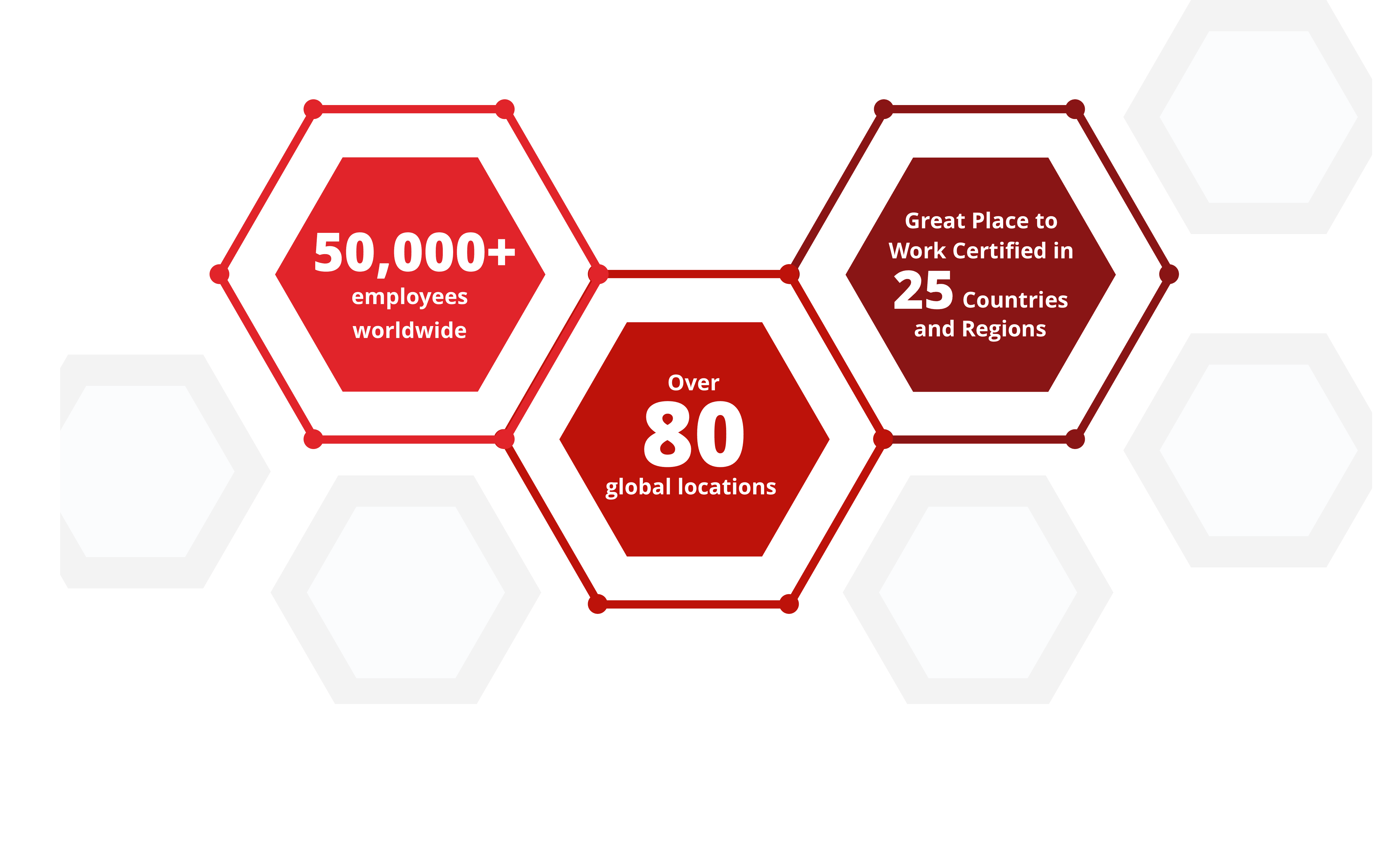
By the Numbers - (Section 15a)
Suggested Use: Graphic showing company hiring statistics, with supporting copy
Notes: N/A
Available Code Snippets: N/A
Our footprint by the numbers
Disclosure - (Section 16a)
Suggested Use: Benefit description and details
Notes: Icon image assets intended for any "Section 16 - Icon Heading" Media Module may be found in the CMS folder (/cms/icons) and will include a "section-16" prefix in their file name. New icon image assets saved to this folder should be formatted and named in the same manner as the others.
To remove the icon from a "Section 16 - Icon Heading" Media Module, simply click the delete (trash) icon in the Media Module's "Primary Asset" field.
Available Code Snippets: N/A
Icon specifications: 65px * 72px [width * height]
Lorem ipsum dolor
Lorem ipsum dolor sit amet, consectetur adipiscing elit. Etiam congue, urna eu efficitur accumsan, massa sem rhoncus elit, eu mattis erat metus gravida dolor.
Lorem ipsum dolor sit amet, consectetur adipiscing elit. Etiam congue, urna eu efficitur accumsan, massa sem rhoncus elit, eu mattis erat metus gravida dolor. Maecenas imperdiet sodales dolor, sit amet malesuada lorem tincidunt in. Nunc a risus augue. Sed pellentesque pharetra iaculis. Donec gravida risus ut placerat venenatis. Integer sed erat eget risus rutrum condimentum. Curabitur tincidunt nisl ornare, viverra est eget, condimentum lectus. Integer pretium justo ac odio vestibulum ornare. Nullam mi risus, faucibus lacinia justo et, auctor vehicula lectus.
Related Content Static - (Section 17a)
Suggested Use: 3 "related content" links, with supporting intro copy above
Notes: While page titles are not visually present on the link cards, they are still being used as the link text for each card (the link text is hidden from visual users.) So all pages featured in this section should have an appropriate title, even if the title is not visible on the cards.
Available Code Snippets:
- Section 17 - Copy RESET: Use in any "Section 17 - Copy" Module to "reset" content to its default state. Before using, clear all content in the Module's content editor.
Image Specifications: 550px * 350px [width * height]
Supported Formats: Videos: MP4, OGG, WEBM
Images: PNG, SVG, JPG, WEBP, GIF
PDF: Accepted
Max file sizes: 5 MB for images and 20 MB for videos
Lorem ipsum dolor sit amet
Lorem ipsum dolor sit amet, consectetur adipiscing elit, sed do eiusmod tempor incididunt ut labore et dolore magna aliqua. Ut enim ad minim veniam, quis nostrud exercitation ullamco laboris nisi ut aliquip ex ea.
FAQs - (Section 18a)
Suggested Use: Icon heading with a set of 1 or more FAQs
Notes: To add a new FAQ to a section created from this template, go to the section and click the "copy" icon button on the last "Section 18 - FAQ [number]" Custom HTML Module, to create a new module. Give the new module the same name as the original, but increment the number at the end by 1. You may then edit the new module as needed.
Icon image assets intended for any "Section 18 - Icon Heading" Media Module may be found in the CMS folder (/cms/icons) and will include a "section-18" prefix in their file name. New icon image assets saved to this folder should be formatted and named in the same manner as the others.
To remove the icon from a "Section 18 - Icon Heading" Media Module, simply click the delete (trash) icon in the Media Module's "Primary Asset" field.
Available Code Snippets:
- Section 18 - FAQ RESET: Use in any "Section 18 - FAQ [number]" Module to "reset" content to its default state. Before using, clear all content in the Module's content editor.
Icon specifications: 55px * 71px [width * height]
Lorem ipsum dolor
Lorem ipsum dolor sit amet, consectetur adipiscing elit, sed do eiusmod tempor incididunt ut labore et dolore magna aliqua. Ut enim ad minim veniam, quis nostrud exercitation ullamco laboris nisi ut aliquip ex ea commodo consequat. Duis aute irure dolor in reprehenderit in voluptate velit esse cillum dolore eu fugiat nulla pariatur.
Lorem ipsum dolor sit amet, consectetur adipiscing elit, sed do eiusmod tempor incididunt ut labore et dolore magna aliqua. Ut enim ad minim veniam, quis nostrud exercitation ullamco laboris nisi ut aliquip ex ea commodo consequat. Duis aute irure dolor in reprehenderit in voluptate velit esse cillum dolore eu fugiat nulla pariatur.
Tablist - (Section 19a)
Suggested Use: "Jobs For You" Tabs (Featured Jobs, Recently Viewed Jobs, Saved Jobs)
Notes: N/A
Available Code Snippets: N/A
Jobs for you
- QA Engineer Tianjin, China Category: Quality
- Maintenance Engineer Tianjin, China Category: Manufacturing Engineering
- People Solutions Specialist (German Speaker) Lodz, Poland Category: Human Resources
- DD&T Digital Dexterity Implementation Lead Cambridge, Massachusetts Category: Data, Digital and Technology
You have not viewed any jobs yet.
You have not saved any jobs yet.
Slider - (Section 20a)
Suggested Use: Slider that can take any number slides. Each slide contains an image and text
Notes: Text and Image both are both contained in "Section 20 slide module"
Available Code Snippets: v3 - Red line heading
Image specifications: 550px * 335px [width * height]
Supported Formats: Videos: MP4, OGG, WEBM
Images: PNG, SVG, JPG, WEBP, GIF
PDF: Accepted
Max file sizes: 5 MB for images and 20 MB for videos
Lorem ipsum dolor sit amet, consectetur

Lorem ipsum dolor sit amet, consectetur adipiscing elit, sed do eiusmod tempor incididunt ut labore et dolore magna aliqua. Ut enim ad minim veniam, quis nostrud exercitation ullamco laboris nisi ut aliquip ex ea commodo consequat.
Lorem ipsum dolor sit amet, consectetur adipiscing elit, sed do eiusmod tempor incididunt ut labore et dolore magna aliqua. Ut enim ad minim veniam, quis nostrud exercitation ullamco laboris nisi ut aliquip ex ea commodo consequat.
Lorem ipsum dolor sit amet, consectetur adipiscing elit, sed do eiusmod tempor incididunt ut labore et dolore magna aliqua. Ut enim ad minim veniam, quis nostrud exercitation ullamco laboris nisi ut aliquip ex ea commodo consequat.
Slider - (Section 20b)
Suggested Use: Slider that can take any number slides. Each slide contains an image and text
Notes: Text and Image both are both contained in "Section 20 slide module"
Available Code Snippets: See above
Image specifications: 550px * 335px [width * height]
Supported Formats: Videos: MP4, OGG, WEBM
Images: PNG, SVG, JPG, WEBP, GIF
PDF: Accepted
Max file sizes: 5 MB for images and 20 MB for videos
Lorem ipsum dolor sit amet, consectetur
Lorem ipsum dolor sit amet, consectetur adipiscing elit, sed do eiusmod tempor incididunt ut labore et dolore magna aliqua. Ut enim ad minim veniam, quis nostrud exercitation ullamco laboris nisi ut aliquip ex ea.Lorem ipsum dolor sit amet, consectetur adipiscing elit, sed do eiusmod tempor incididunt ut labore et dolore magna aliqua. Ut enim ad minim veniam, quis nostrud exercitation ullamco laboris nisi ut aliquip ex ea.Lorem ipsum dolor sit amet, consectetur adipiscing elit, sed do eiusmod tempor incididunt ut labore et dolore magna aliqua. Ut enim ad minim veniam, quis nostrud exercitation ullamco laboris nisi ut aliquip ex ea.Lorem ipsum dolor sit amet, consectetur adipiscing elit, sed do eiusmod tempor incididunt ut labore et dolore magna aliqua. Ut enim ad minim veniam, quis nostrud exercitation .
Lorem ipsum dolor sit amet, consectetur adipiscing elit, sed do eiusmod tempor incididunt ut labore et dolore magna aliqua. Ut enim ad minim veniam, quis nostrud exercitation ullamco laboris nisi ut aliquip ex ea.Lorem ipsum dolor sit amet, consectetur adipiscing elit, sed do eiusmod tempor incididunt ut labore et dolore magna aliqua. Ut enim ad minim veniam, quis nostrud exercitation ullamco laboris nisi ut aliquip ex ea.Lorem ipsum dolor sit amet, consectetur adipiscing elit, sed do eiusmod tempor incididunt ut labore et dolore magna aliqua. Ut enim ad minim veniam, quis nostrud exercitation ullamco laboris nisi ut aliquip ex ea.Lorem ipsum dolor sit amet, consectetur adipiscing elit, sed do eiusmod tempor incididunt ut labore et dolore magna aliqua. Ut enim ad minim veniam, quis nostrud exercitation ullamco laboris nisi ut aliquip ex ea.
Lorem ipsum dolor sit amet, consectetur adipiscing elit, sed do eiusmod tempor incididunt ut labore et dolore magna aliqua. Ut enim ad minim veniam, quis nostrud exercitation ullamco laboris nisi ut aliquip ex ea.Lorem ipsum dolor sit amet, consectetur adipiscing elit, sed do eiusmod tempor incididunt ut labore et dolore magna aliqua. Ut enim ad minim veniam, quis nostrud exercitation ullamco laboris nisi ut aliquip ex ea.Lorem ipsum dolor sit amet, consectetur adipiscing elit, sed do eiusmod tempor incididunt ut labore et dolore magna aliqua. Ut enim ad minim veniam, quis nostrud exercitation ullamco laboris nisi ut aliquip ex ea.Lorem ipsum dolor sit amet, consectetur adipiscing elit, sed do eiusmod tempor incididunt ut labore et dolore magna aliqua. Ut enim ad minim veniam, quis nostrud exercitation ullamco laboris nisi ut aliquip ex ea.
Media and Copy - (Section 21a)
Suggested Use: Showcasing media of choice (Image or video) alongside text
Available Code Snippets: N/A
- v3 - Section copy
- v3 - Red line heading
Image specifications: 550px * 335px [width * height]
Supported Formats: Videos: MP4, OGG, WEBM
Images: PNG, SVG, JPG, WEBP, GIF
PDF: Accepted
Max file sizes: 5 MB for images and 20 MB for videos
Lorem ipsum dolor sit amet, consectetur

Lorem ipsum dolor sit amet, consectetur adipiscing elit, sed do eiusmod tempor incididunt ut labore et dolore magna aliqua. Ut enim ad minim veniam, quis nostrud exercitation ullamco laboris nisi ut aliquip ex ea commodo consequat.
Media and Copy - (Section 21b)
Suggested Use: Showcasing media of choice (Image or video) alongside text
Available Code Snippets: See above
Image specifications: 550px * 335px [width * height]
Supported Formats: Videos: MP4, OGG, WEBM
Images: PNG, SVG, JPG, WEBP, GIF
PDF: Accepted
Max file sizes: 5 MB for images and 20 MB for videos
Lorem ipsum dolor sit amet, consectetur
Lorem ipsum dolor sit amet, consectetur adipiscing elit, sed do eiusmod tempor incididunt ut labore et dolore magna aliqua. Ut enim ad minim veniam, quis nostrud exercitation ullamco laboris nisi ut aliquip ex ea.Lorem ipsum dolor sit amet, consectetur adipiscing elit, sed do eiusmod tempor incididunt ut labore et dolore magna aliqua. Ut enim ad minim veniam, quis nostrud exercitation ullamco laboris nisi ut aliquip ex ea.Lorem ipsum dolor sit amet, consectetur adipiscing elit, sed do eiusmod tempor incididunt ut labore et dolore magna aliqua. Ut enim ad minim veniam, quis nostrud exercitation ullamco laboris nisi ut aliquip ex ea.Lorem ipsum dolor sit amet, consectetur adipiscing elit, sed do eiusmod tempor incididunt ut labore et dolore magna aliqua. Ut enim ad minim veniam, quis nostrud exercitation .
Image and Copy - (Section 22a)
Suggested Use: Tall image and copy
Notes: This section takes a TALL image that hugs the edge of the section and grows the full width of the borwser
Available Code Snippets: v3 - Setion copy with heading
Image Specifications: 470px * 650px [width * height]
Supported Formats: Videos: MP4, OGG, WEBM
Images: PNG, SVG, JPG, WEBP, GIF
PDF: Accepted
Max file sizes: 5 MB for images and 20 MB for videos

Lorem ipsum dolor
Lorem ipsum dolor sit amet, consectetur adipiscing elit, sed do eiusmod tempor incididunt ut labore et dolore magna aliqua. Ut enim ad minim veniam, quis nostrud exercitation ullamco laboris nisi ut aliquip ex ea commodo consequat.
Image and Copy - (Section 22b)
Suggested Use: Tall image and copy
Notes: This section takes a TALL image that hugs the edge of the section and grows the full width of the borwser
Available Code Snippets: See above
Image Specifications: 470px * 650px [width * height]
Supported Formats: Videos: MP4, OGG, WEBM
Images: PNG, SVG, JPG, WEBP, GIF
PDF: Accepted
Max file sizes: 5 MB for images and 20 MB for videos
Lorem ipsum dolor
Lorem ipsum dolor sit amet, consectetur adipiscing elit, sed do eiusmod tempor incididunt ut labore et dolore magna aliqua. Ut enim ad minim veniam, quis nostrud exercitation ullamco laboris nisi ut aliquip ex ea commodo consequat.
Slider - (Section 23a)
Suggested Use: Slider for up to 3 slides with image and copy.
Notes: Slider with pulse image with margins and max width
Available Code Snippets: N/A
Image Specifications: 550px * 350px [width * height]
Supported Formats: Videos: MP4, OGG, WEBM
Images: PNG, SVG, JPG, WEBP, GIF
PDF: Accepted
Max file sizes: 5 MB for images and 20 MB for videos
Lorem ipsum dolor
Lorem ipsum dolor sit amet, consectetur adipiscing elit, sed do eiusmod tempor incididunt ut labore et dolore magna aliqua. Ut enim ad minim veniam, quis nostrud exercitation ullamco laboris nisi ut aliquip ex ea commodo consequat.
Lorem ipsum dolor sit amet, consectetur adipiscing elit, sed do eiusmod tempor incididunt ut labore et dolore magna aliqua. Ut enim ad minim veniam, quis nostrud exercitation ullamco laboris nisi ut aliquip ex ea commodo consequat.
Lorem ipsum dolor sit amet, consectetur adipiscing elit, sed do eiusmod tempor incididunt ut labore et dolore magna aliqua. Ut enim ad minim veniam, quis nostrud exercitation ullamco laboris nisi ut aliquip ex ea commodo consequat.
Image and Copy - (Section 24a)
Suggested Use: Image and copy
Notes: Image and copy with margins and max width
Available Code Snippets: N/A
Image Specifications: 550px * 350px [width * height]
Supported Formats: Videos: MP4, OGG, WEBM
Images: PNG, SVG, JPG, WEBP, GIF
PDF: Accepted
Max file sizes: 5 MB for images and 20 MB for videos
Lorem ipsum dolor
Lorem ipsum dolor sit amet, consectetur adipiscing elit, sed do eiusmod tempor incididunt ut labore et dolore magna aliqua. Ut enim ad minim veniam, quis nostrud exercitation ullamco laboris nisi ut aliquip ex ea commodo consequat.
Background Image and Copy - (Section 25a)
Suggested Use: Textblock with full width image background
Notes: Choose large image 1440x470 as the section does not have a max width. Add image to media module
Available Code Snippets: v3 - Section 25 - Copy
Image Specifications: 1440px * 470px [width * height]
Supported Formats: Videos: MP4, OGG, WEBM
Images: PNG, SVG, JPG, WEBP, GIF
PDF: Accepted
Max file sizes: 5 MB for images and 20 MB for videos

Lorem ipsum dolor sit amet, consectetur
Lorem ipsum dolor sit amet, consectetur adipiscing elit, sed do eiusmod tempor incididunt ut labore et dolore magna aliqua. Ut enim ad minim veniam, quis nostrud exercitation ullamco laboris nisi ut aliquip ex ea commodo consequat. Duis aute irure dolor in reprehenderit in voluptate velit esse cillum dolore eu fugiat nulla pariatur. Excepteur sint occaecat cupidatat non proident, sunt in culpa qui officia deserunt mollit anim id est laborum.
Awards - (Section 26a)
Suggested Use: To show awards
Notes: This is an alternative to the awards section that auto scrolls
Available Code Snippets: N/A
Image Specifications: 168px * 192px [width * height]
Supported Formats: Videos: MP4, OGG, WEBM
Images: PNG, SVG, JPG, WEBP, GIF
PDF: Accepted
Max file sizes: 5 MB for images and 20 MB for videos
Lorem ipsum dolor sit amet, consectetur 26


Background Image and Copy - (Section 27a)
Suggested Use: Text block with full width image
Notes: Gray textblock with pulse image
Available Code Snippets: v3 - Section 27 - Copy
Image Specifications: 1440px * 470px [width * height]
Supported Formats: Videos: MP4, OGG, WEBM
Images: PNG, SVG, JPG, WEBP, GIF
PDF: Accepted
Max file sizes: 5 MB for images and 20 MB for videos

Lorem ipsum dolor sit amet, consectetur adipiscing elit, sed do eiusmod tempor incididunt ut labore et dolore magna aliqua Ut enim ad minim.Lorem ipsum dolor sit amet, consectetur adipiscing elit, sed do eiusmod tempor incididunt ut labore et dolore magna
Background Image and Copy - (Section 27b)
Suggested Use: Text block with full width image
Notes: Gray textblock with no pulse image
Available Code Snippets: v3 - Section 27 - Copy
Image Specifications: 1440px * 470px [width * height]
Supported Formats: Videos: MP4, OGG, WEBM
Images: PNG, SVG, JPG, WEBP, GIF
PDF: Accepted
Max file sizes: 5 MB for images and 20 MB for videos
Lorem ipsum dolor sit amet, consectetur adipiscing elit, sed do eiusmod tempor incididunt ut labore et dolore magna aliqua. Ut enim ad minim veniam, quis nostrud exercitation ullamco laboris nisi ut aliquip ex ea commodo consequat. Duis aute irure dolor in reprehenderit in voluptate velit esse cillum dolore eu fugiat nulla pariatur. Excepteur sint occaecat cupidatat non.
Cards - (Section 28a)
Suggested Use: 3 cards with icon and text
Notes: Choose icon that is 100x100
Available Code Snippets: v3 - Section 28 - Card
Lorem ipsum dolor sit amet, consectetur
Lorem ipsum
Lorem ipsum dolor sit amet, consectetur adipiscing elit, sed do eiusmod tempor incididunt ut labore et dolore magna aliqua.
Lorem ipsum
Lorem ipsum dolor sit amet, consectetur adipiscing elit, sed do eiusmod tempor incididunt ut labore et dolore magna aliqua.
Lorem ipsum
Lorem ipsum dolor sit amet, consectetur adipiscing elit, sed do eiusmod tempor incididunt ut labore et dolore magna aliqua.
Media and Copy - (Section 29a)
Suggested Use: Large video with headline and text
Notes: has text and button under video
Available Code Snippets: v3 - Section 29 - Copy
Image Specifications: 1035px * 400px [width * height]
Supported Formats: Videos: MP4, OGG, WEBM
Images: PNG, SVG, JPG, WEBP, GIF
PDF: Accepted
Max file sizes: 5 MB for images and 20 MB for videos
Lorem ipsum dolor sit amet, consectetur
Lorem ipsum dolor sit amet, consectetur adipiscing elit, sed do eiusmod tempor incididunt ut labore et dolore magna aliqua. Ut enim ad minim veniam, quis nostrud exercitation ullamco laboris nisi ut aliquip ex ea commodo consequat.
Media and Copy - (Section 29b)
Suggested Use: Large video with headline
Notes: variant of 29a with no text under video
Available Code Snippets: N/A
Image Specifications: 1035px * 400px [width * height]
Supported Formats: Videos: MP4, OGG, WEBM
Images: PNG, SVG, JPG, WEBP, GIF
PDF: Accepted
Max file sizes: 5 MB for images and 20 MB for videos
Lorem ipsum dolor sit amet, consectetur
Media and Copy-(Section 29d)
Suggested Use: Large video with headline
Notes: variant of 29a with no text under the video and a white background.
Available Code Snippets: N/A
Image Specifications: 1035px * 400px [width * height]
Supported Formats: Videos: MP4, OGG, WEBM
Images: PNG, SVG, JPG, WEBP, GIF
PDF: Accepted
Max file sizes: 5 MB for images and 20 MB for videos
Lorem ipsum dolor sit amet, consectetur
Globe and Copy - (Section 30a)
Suggested Use: Text with spinning globe animation
Notes: Globe animation with location pins
Available Code Snippets: v3 - Section 30 - Copy
Lorem ipsum dolor
Lorem ipsum dolor sit amet, consectetur adipiscing elit, sed do eiusmod tempor incididunt ut labore et dolore magna aliqua. Ut enim ad minim veniam, quis nostrud exercitation ullamco laboris nisi ut aliquip.
- Lorem Ipsum
- Lorem Ipsum
- Lorem Ipsum
- Lorem Ipsum
- Lorem Ipsum
- Lorem Ipsum
Globe and Copy - (Section 30b)
Suggested Use: Text with spinning globe animation
Notes: Globe animation with NO location pins
Available Code Snippets: v3 - Section 30 - Copy
Lorem ipsum dolor
Lorem ipsum dolor sit amet, consectetur adipiscing elit, sed do eiusmod tempor incididunt ut labore et dolore magna aliqua. Ut enim ad minim veniam, quis nostrud exercitation ullamco laboris nisi ut aliquip.
- Lorem Ipsum
- Lorem Ipsum
- Lorem Ipsum
- Lorem Ipsum
- Lorem Ipsum
- Lorem Ipsum
Related Content Static - (Section 31a)
Suggested Use: 3 "related content" links, with headline
Notes: This related content is static only
Available Code Snippets: N/A
Image Specifications: 390px * 225px [width * height]
Supported Formats: Videos: MP4, OGG, WEBM
Images: PNG, SVG, JPG, WEBP, GIF
PDF: Accepted
Max file sizes: 5 MB for images and 20 MB for videos
Lorem ipsum dolor sit amet, consectetur
Cards - (Section 32a)
Suggested Use: 3 cards with text under and intro
Notes:3 Cards right justified
Available Code Snippets: v3 - Section 32 - Intro
Image Specifications: 285px * 285px [width * height]
Supported Formats: Videos: MP4, OGG, WEBM
Images: PNG, SVG, JPG, WEBP, GIF
PDF: Accepted
Max file sizes: 5 MB for images and 20 MB for videos
Lorem ipsum dolor sit amet
Lorem ipsum dolor sit amet, consectetur adipiscing elit, sed do eiusmod tempor incididunt ut labore et dolore magna aliqua. Ut enim ad minim veniam, quis nostrud exercitation ullamco laboris nisi ut aliquip ex ea.Lorem ipsum dolor sit amet, consectetur adipiscing elit, sed do eiusmod tempor incididunt ut labore et

Cards - (Section 32b)
Suggested Use: 3 cards with text under and intro
Notes:3 Cards center justified
Available Code Snippets: See above
Image Specifications: 285px * 285px [width * height]
Supported Formats: Videos: MP4, OGG, WEBM
Images: PNG, SVG, JPG, WEBP, GIF
PDF: Accepted
Max file sizes: 5 MB for images and 20 MB for videos
Lorem ipsum dolor sit amet
Lorem ipsum dolor sit amet, consectetur adipiscing elit, sed do eiusmod tempor incididunt ut labore et dolore magna aliqua. Ut enim ad minim veniam, quis nostrud exercitation ullamco laboris nisi ut aliquip ex ea.Lorem ipsum dolor sit amet, consectetur adipiscing elit, sed do eiusmod tempor incididunt ut labore et
Cards - (Section 32c)
Suggested Use: 4 cards with text under and intro
Notes:4 Cards center justified
Available Code Snippets: See above
Image Specifications: 285px * 285px [width * height]
Supported Formats: Videos: MP4, OGG, WEBM
Images: PNG, SVG, JPG, WEBP, GIF
PDF: Accepted
Max file sizes: 5 MB for images and 20 MB for videos
Lorem ipsum dolor sit amet
Lorem ipsum dolor sit amet, consectetur adipiscing elit, sed do eiusmod tempor incididunt ut labore et dolore magna aliqua. Ut enim ad minim veniam, quis nostrud exercitation ullamco laboris nisi ut aliquip ex ea.Lorem ipsum dolor sit amet, consectetur adipiscing elit, sed do eiusmod tempor incididunt ut labore et
Textblock - (Section 33a)
Suggested Use: general copy with headline
Notes:Lorem Ipsum
Available Code Snippets: v3 - Section copy with heading
Lorem ipsum dolor sit amet, consectetur
Lorem ipsum dolor sit amet, consectetur adipiscinget dolore magna aliqua. Ut enim ad minim veniam, quis nostrud exercitation ullamco laboris nisi ut aliquip ex ea. elit, sed do eiusmod
Textblock - (Section 33b)
Suggested Use: general copy with no headline
Notes:Lorem Ipsum
Available Code Snippets: v3 - Section copy
Lorem ipsum dolor sit amet, consectetur adipiscinget dolore magna aliqua. Ut enim ad minim veniam, quis nostrud exercitation ullamco laboris nisi ut aliquip ex ea. elit, sed do eiusmod
Video Banner - (Section 34a)
Suggested Use: Video Banner with intro under
Notes:works best with videos with a height of 300px
Available Code Snippets: v3 - Red line heading
Lorem ipsum dolor sit amet, consectetur
Lorem ipsum dolor sit amet, consectetur adipiscing elit, sed do eiusmod tempor incididunt ut labore et dolore magna aliqua. Ut enim ad minim veniam, quis nostrud exercitation ullamco laboris nisi ut aliquip ex ea.Lorem ipsum dolor sit amet, consectetur adipiscing elit, sed do eiusmod tempor incididunt ut labore et
Testimonial - (Section 35a)
Suggested Use:Testimonal slider Employee photos with testimonials/quotes
Notes: holds up to 3 slides
Available Code Snippets: v3 - Red line heading
Image Specifications: 350px * 350px [width * height]
Supported Formats: Videos: MP4, OGG, WEBM
Images: PNG, SVG, JPG, WEBP, GIF
PDF: Accepted
Max file sizes: 5 MB for images and 20 MB for videos
Lorem ipsum dolor sit amet, consectetur
Lorem ipsum dolor sit amet, consectetur adipiscing elit, sed do eiusmod tempor incididunt ut labore et dolore magna aliqua. Ut enim ad minim veniam, quis nostrud exercitation ullamco laboris. Duis aute irure dolor in reprehenderit in voluptate velit esse cillum dolore eu fugiat nulla.
Lorem ipsum dolor sit amet– consectetur adipiscing
Testimonial - (Section 35b)
Suggested Use: Single testionail with employee image and quote
Notes: Same as above but with no slider
Available Code Snippets: v3 - Red line heading
Image Specifications: 350px * 350px [width * height]
Supported Formats: Videos: MP4, OGG, WEBM
Images: PNG, SVG, JPG, WEBP, GIF
PDF: Accepted
Max file sizes: 5 MB for images and 20 MB for videos
Lorem ipsum dolor sit amet, consectetur
Lorem ipsum dolor sit amet, consectetur adipiscing elit, sed do eiusmod tempor incididunt ut labore et dolore magna aliqua. Ut enim ad minim veniam, quis nostrud exercitation ullamco laboris. Duis aute irure dolor in reprehenderit in voluptate velit esse cillum dolore eu fugiat nulla.
Lorem ipsum dolor sit amet– consectetur adipiscing
Testimonial - (Section 36a)
Suggested Use: Testimonial slider with employee image and quote
Notes: Large image that sticks to right side with no max width. Pulse image has max width and margins
Available Code Snippets: N/A
Image Specifications: 470px * 650px [width * height]
Supported Formats: Videos: MP4, OGG, WEBM
Images: PNG, SVG, JPG, WEBP, GIF
PDF: Accepted
Max file sizes: 5 MB for images and 20 MB for videos
Lorem ipsum dolor sit amet, consectetur adipiscing elit, sed do eiusmod tempor incididunt ut labore et dolore magna aliqua. Ut enim ad minim veniam, quis nostrud exercitation ullamco laboris.
Lorem ipsum dolor sit amet– consectetur adipiscing
Lorem ipsum dolor sit amet, consectetur adipiscing elit, sed do eiusmod tempor incididunt ut labore et dolore magna aliqua. Ut enim ad minim veniam, quis nostrud exercitation ullamco laboris.
Lorem ipsum dolor sit amet– consectetur adipiscing
Lorem ipsum dolor sit amet, consectetur adipiscing elit, sed do eiusmod tempor incididunt ut labore et dolore magna aliqua. Ut enim ad minim veniam, quis nostrud exercitation ullamco laboris.
Lorem ipsum dolor sit amet– consectetur adipiscing
Lorem ipsum dolor sit amet, consectetur adipiscing elit, sed do eiusmod tempor incididunt ut labore et dolore magna aliqua. Ut enim ad minim veniam, quis nostrud exercitation ullamco laboris.
Lorem ipsum dolor sit amet– consectetur adipiscing
Testimonial - (Section 36b)
Suggested Use: Testimonial slider with employee image and quote
Notes: Large image that sticks to left side with no max width. Pulse image goes max with of browser
Available Code Snippets: N/A
Image Specifications: 470px * 650px [width * height]
Supported Formats: Videos: MP4, OGG, WEBM
Images: PNG, SVG, JPG, WEBP, GIF
PDF: Accepted
Max file sizes: 5 MB for images and 20 MB for videos
Lorem ipsum dolor sit amet, consectetur adipiscing elit, sed do eiusmod tempor incididunt ut labore et dolore magna aliqua. Ut enim ad minim veniam, quis nostrud exercitation ullamco laboris.
Lorem ipsum dolor sit amet– consectetur adipiscing
Lorem ipsum dolor sit amet, consectetur adipiscing elit, sed do eiusmod tempor incididunt ut labore et dolore magna aliqua. Ut enim ad minim veniam, quis nostrud exercitation ullamco laboris.
Lorem ipsum dolor sit amet– consectetur adipiscing
Lorem ipsum dolor sit amet, consectetur adipiscing elit, sed do eiusmod tempor incididunt ut labore et dolore magna aliqua. Ut enim ad minim veniam, quis nostrud exercitation ullamco laboris.
Lorem ipsum dolor sit amet– consectetur adipiscing
Lorem ipsum dolor sit amet, consectetur adipiscing elit, sed do eiusmod tempor incididunt ut labore et dolore magna aliqua. Ut enim ad minim veniam, quis nostrud exercitation ullamco laboris.
Lorem ipsum dolor sit amet– consectetur adipiscing
Testimonial - (Section 36c)
Suggested Use:Single testimonial with employee image and quote
Notes: Large image that sticks to right side with no max width. Pulse image has max width and margins
Available Code Snippets: N/A
Image Specifications: 470px * 650px [width * height]
Supported Formats: Videos: MP4, OGG, WEBM
Images: PNG, SVG, JPG, WEBP, GIF
PDF: Accepted
Max file sizes: 5 MB for images and 20 MB for videos
Lorem ipsum dolor sit amet, consectetur adipiscing elit, sed do eiusmod tempor incididunt ut labore et dolore magna aliqua. Ut enim ad minim veniam, quis nostrud exercitation ullamco laboris.
Lorem ipsum dolor sit amet– consectetur adipiscing
Testimonial - (Section 36d)
Suggested Use:Single testimonial with employee image and quote
Notes: Large image that sticks to left side with no max width. Pulse image goes full width of the browser
Available Code Snippets: N/A
Image Specifications: 470px * 650px [width * height]
Supported Formats: Videos: MP4, OGG, WEBM
Images: PNG, SVG, JPG, WEBP, GIF
PDF: Accepted
Max file sizes: 5 MB for images and 20 MB for videos
Lorem ipsum dolor sit amet, consectetur adipiscing elit, sed do eiusmod tempor incididunt ut labore et dolore magna aliqua. Ut enim ad minim veniam, quis nostrud exercitation ullamco laboris.
Lorem ipsum dolor sit amet– consectetur adipiscing
CTA - (Section 37a)
Suggested Use: Job Search CTA + Talent Community CTA
Notes: N/A
Available Code Snippets: N/A
Build your future. Transform healthcare.
Make History.
Change Futures.
Tabcordian - (Section 38a)
Suggested Use: Tabs with text and image
Notes: Tabs are not cms editable but add new to dupicate
Available Code Snippets:
- N/A
Image Specifications: 560px * 300px [width * height]
Supported Formats: Videos: MP4, OGG, WEBM
Images: PNG, SVG, JPG, WEBP, GIF
PDF: Accepted
Max file sizes: 5 MB for images and 20 MB for videos
Lorem ipsum dolor sit amet, consectetur

Tristique Senectus
Lorem ipsum dolor sit amet, consectetur adipiscing elit, sed do eiusmod tempor incididunt ut labore et dolore magna aliqua. Ut enim ad minim veniam, quis nostrud exercitation ullamco laboris nisi ut aliquip.
Vestibulum Tortor Quam
Lorem ipsum dolor sit amet, consectetur adipiscing elit, sed do eiusmod tempor incididunt ut labore et dolore magna aliqua. Ut enim ad minim veniam, quis nostrud exercitation ullamco laboris nisi ut aliquip.
Turpis Egestas
Lorem ipsum dolor sit amet, consectetur adipiscing elit, sed do eiusmod tempor incididunt ut labore et dolore magna aliqua. Ut enim ad minim veniam, quis nostrud exercitation ullamco laboris nisi ut aliquip.
Divider - (Section 42a)
Suggested Use: Divider

Note To Developer: Please include documentation for this section!
Featured Content
-

-
Frequently Asked Questions
-
Dev Guide (New)
-
Healthcare for all
-
How We Partner
-
Innovators in Science Award Winners
-
Luck is not a strategy
-
Takeda Unveils Newly Renovated Cambridge Building
-
Our Commitment to the Planet
-
Our Products
-
Our R&D Pipeline
-
Patient Story: Rosie
-
Putting Patients First
-
Sustainable Value Report 2023
-
Informiere dich über Stellenangebote Takedas Produktionsstandort
-
Takeda Global Headquarters
-
Takeda in the US
-
Takeda’s Global CSR Program
-
The History of Takeda
-
Values and Corporate Governance
-
Takeda Manufacturing - 2021 Facilities of the Year
-
Takeda Acquires Adaptate Therapeutics
-
BioLife Plasma Services
-
Biotech Site in Covington, GA
-
Takeda’s Position on Climate Change
-
Corporate Responsibility
-
Diversity, Equity and Inclusion
-
Loni's Data Science Story
-
Takeda Breaks Ground on its First Zero Energy Building
-
Life at Takeda Pharmaceutical
-
Tokyo
-
Zurich
-
Discover Innovative Opportunities at Takeda's Greater Boston Presence
-
Employee Spotlight: Eni A. from MA Bio Ops - Bio OpU
-
Employee Spotlight: Tito from MA Bio Ops - Bio OpU
-
Our Climate Action Programs are making a positive impact
-
Learn About Takeda in Osaka
-
Learn About Takeda in Hikari
-
Learn About Takeda in Narita
-
Career Growth: Doug Coffman
-
Career Growth: Gundula Schneidewind
-
Career Moves: Mohamed Galal
-
Career Moves: Career Growth at Takeda
-
DEI Clinical Advisory Board
-
Innovation Capability Centers
-
Research and Development
-
US Medical and Scientific Communications Fellowship
-
US Medical and Field Medical Fellowship
-
Explore career opportunities at Takeda's facility in Vashi, India.
-
Über Takeda in Wien
-
Career Growth: Waqas Younus
-
Working Here
-
Building A Future In STEM: Driving Success Through Inclusion
-
Innovation With Purpose: Solving Problems Using The Power Of Data
-
Health Economics and Outcomes Research Fellowship
-
Takeda's career opportunities across Ireland.
-
Jaguariuna Manufacturing Facility
-
Lessines, Belgium Manufacturing Facility
-
Takeda's Manufacturing Site in Los Angeles
-
Marketed Product Development Fellowship
-
Explore career opportunities at Takeda's facility in Naucalpan, Mexico.
-
Takeda Gastrointestinal & Inflammation Clinical Sciences Fellowship
-
Über Takeda in Orth an der Donau
-
Outcomes Research & Data Science Fellowship
-
Post-Doctoral Fellowship Programs Overview
-
Redefining STEM Futures for Students
-
Global Regulatory Affairs, Drugs & Biologics Fellowship
-
Global Regulatory Affairs, Labeling Strategy Fellowship
-
Your Next Challenge: Driving Rapid Change Through Your Ideas
-
Explore career opportunities at Takeda's facility in Tianjin, China.
-
Takeda's Brooklyn Park Manufacturing Facility - BIO OPU
-
Takedas Cobot in Singen
-
Explore career opportunities at Takeda's manufacturing facility in Covington, Georgia.
-
Data, Digital & Technology (DDT) in GMSGQ
-
Engineering EVP Highlight
-
Augmented Mixed and Virtual Reality is changing how we work
-
Über Takeda in Linz
-
Takeda's MA Bio Manufacturing Facility - Bio OpU
-
Neuchâtel Manufacturing Facility
-
Über Arbeitsplätze am Produktionsstandort von Takeda in Oranienburg, Region Berlin-Brandenburg
-
About the GMSGQ Plasma Operating Unit
-
Takeda Manufacturing Italia (sedi di Rieti e Pisa) sta assumendo
-
Takeda Pharmaceuticals Round Lake Manufacturing Facility
-
Working as a Manufacturing Technician in Round Lake
-
Takeda's manufacturing facility in Singapore
-
Takeda’s ‘Sustainability by Design’ program takes planet-led approach
-
For Takeda employees in Thousand Oaks "Every Vial Has a Name" - Bio OpU
-
Saving millions of gallons of water in our Los Angeles facility
-
Über Takeda in Österreich
-
Explore career opportunities at Takeda's facility in Bekasi, Indonesia.
-
Career Growth at Takeda
-
Employee Spotlight: Dindi Whitmore
-
Diversity, Equity and Inclusion at Takeda
-
Integrity in the Aftermath of a Historic Earthquake
-
Global Regulatory Affairs – Plasma Derived Therapies
-
Global Clinical Operations Fellowship
-
Global Clinical Supply Chain Fellowship
-
Takeda Global Medical Affairs Fellowship
-
Global Medical Communications Fellowship
-
Global Medical Information & Review Fellowship
-
Global Patient Safety Evaluation Fellowship
-
Revolutionizing Patient Treatments Through Biologics
-
Wichtige Prioritäten führen zu großartigen Ergebnissen für Takeda in Österreich
-
Takeda’s Benefits Selected With Care: Supporting Whole-Family Health For Working Parents And Caregivers
-
Career Moves: Christian Stirnimann
-
Career Moves: Lindsey Daniel
-
Career Moves: Maria Alvarez
-
Career Moves: Sarah Bryant
-
Inspiring Female Leadership at Takeda
-
Takeda Resource Group: Ignite
-
Takeda Resource Group: IMPACTO
-
Pioneers Of Change: Shaping The Future Together Through Our IMPACTO Takeda Resource Group
-
Careers with Purpose: Amplifying Employee Passions and Patient Voices
-
Our Past Drives Our Future: How Takeda’s History in Japan Impacts our Work Today
-
Takeda Resource Group: Mosaic
-
Takeda Resource Group: Parents and Caregivers at Takeda
-
Takeda Resource Group: STRIVE
-
Takeda Resource Group: Take Pride
-
Employee Spotlight: LaAngela
-
Trial Diversity, Equity, Inclusion, and Mentorship: Why I’m Proud to Work at Takeda
-
Employee Spotlight: Lindsey D.
-
Employee Spotlight: Molly Silsby
-
Employee Spotlight: Rosa
-
Employee Spotlight: Sharilyn
-
Shinpei's Journey with Takeda
-
Employee Spotlight: Siew Hoo
-
Employee Spotlight: Valerie Quezada
-
Employee Spotlight: Yvonne Burazer
-
Innovation, Mistakes and Psychological Safety: How Takeda Fosters a Growth MindsetInnovation, Mistakes and Psychological Safety: How Takeda Fosters a Growth Mindset
-
Takeda Resource Group: EnAbles
-
Takeda Resource Group: Faith@Work
-
Takeda Resource Group: Gender Parity Network
-
Career Moves: Caroline Slomski
-
Analytics Leadership Development Program (ALDP)
-
Takeda Resource Group: Black Leadership Council
-
Takeda Resource Group: Building Asian Leaders
-
Career Growth: Rola Noueiha
-
Commercial Leadership Development Program (CLDP)
-
Employee Spotlight: Alenoosh
-
Employee Spotlight: Amanda
-
Employee Spotlight: Bryan H.
-
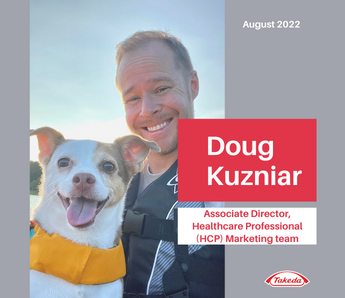
Doug Kuzinar Employee Spotlight
-
Employee Spotlight: Emmanuel
-
Employee Spotlight: Giulia
-
Employee Spotlight: Jeremy Klein
-
Employee Spotlight: José
-
Employee Spotlight: Julien Janda
-
Employee Spotlight: Kenneth B. from Covington
-
Why interns Boomerang: insights from those who came back
-
Global Humanitarian Crisis Leave Policy
-
Learn State-of-the-Art Automation Skills and Work on Real Business Cases With Takeda!
-
Our Sustainability Commitment
-
Career Moves: Averil Lee Neng
-
7 Women in STEM Driving Impact at Takeda
-
5 Ways Takeda is Shaping the Future of Operations Through Digital Manufacturing
-
Career Moves: Helen Grad
-
4 Reasons Candidates Are Joining Team Takeda
-
6 Women Growing Their Careers Through a Takeda Mentorship Program
-
Building a Legacy of Leadership and Belonging Through Our Building Asian Leaders Takeda Resource Group
-
5 Ways Takeda’s Innovation Capability Centers Empower Tech Talent
-
Takeda Summer Internship Program
-
Fostering Inclusion With Our Take Pride Takeda Resource Group
-
How Takeda’s AI Tool Career Navigator Supports Employee Growth
-
How Our Impacto Takeda Resource Group Leads with Inclusive Solutions
-
Career Moves: Filippo Ramondelli
-
Una mirada al interior de Takeda Madrid en Tres Cantos
-
Community, Sustainability, and Well-being: Takeda's Employee Garden
-
From Burnout to Bliss: How Prioritizing Well-Being Transformed My Career
-
Takeda Jobs in India
-
Careers with Purpose
Divider - (Section 42b)
Suggested Use: Divider
Job List - (Section 43a)
Suggested Use: Add job list to page
Notes:
Filter Jobs in the Job List module to choose what kinds of jobs will appear.
Available Code Snippets:
- v3 - Section 43 - Copy
Lorem Ipsum
- QA Engineer Tianjin, China Category: Quality
- Maintenance Engineer Tianjin, China Category: Manufacturing Engineering
- People Solutions Specialist (German Speaker) Lodz, Poland Category: Human Resources
- DD&T Digital Dexterity Implementation Lead Cambridge, Massachusetts Category: Data, Digital and Technology
Lorem ipsum dolor sit amet, sonsectetur adipiscing elit, sed do eiusmod tempor incididunt ut labore et dolore magna aliqua. Ut enim ad minim veniam.
Tile Headline 1
Optional subheadline
Tile Headline 2
Optional subheadline
Tile Headline 3
Optional subheadline
Lorem ipsum dolor sit amet, sonsectetur adipiscing elit, sed do eiusmod tempor incididunt ut labore et dolore magna aliqua. Ut enim ad minim veniam.
Tile Headline 1
Optional subheadline
Tile Headline 1
Optional subheadline
Tile Headline 1
Optional subheadline
Tile Headline 1
Optional subheadline
Callout Headline
Nullam id vestibulum lectus. Curabitur commodo posuere sapien, non vulputate lorem dapibus vitae. Fusce est ligula, tincidunt eget cursus vel, faucibus eget sem.
- Text Additional Text
- Text Additional Text
- Text Additional Text
Callout Headline
Nullam id vestibulum lectus. Curabitur commodo posuere sapien, non vulputate lorem dapibus vitae. Fusce est ligula, tincidunt eget cursus vel, faucibus eget sem.
- Text Additional Text
- Text Additional Text
- Text Additional Text
- Text Additional Text
- Text Additional Text
- Text Additional Text
-
 Content Title Description Text Here
 -
Longer Content Title than the others Description Text Here


Nullam id vestibulum lectus. Curabitur commodo posuere sapien, non vulputate lorem dapibus vitae. Fusce est ligula, tincidunt eget cursus vel, faucibus eget sem1.
- Class aptent taciti sociosqu ad litora torquent per conubia nostra, per inceptos himenaeos.
- Lorem ipsum dolor sit amet, consectetur adipiscing elit.
- Mauris at nisl id sapien eleifend facilisis. Nullam eget molestie sem. Vestibulum eget ante in erat rhoncus fermentum.
- Integer non augue hendrerit mi tempor molestie vitae id urna.
Donec ut pretium justo. Pellentesque cursus fermentum enim, eget pretium sem pretium quis. Nulla eget elit congue, lobortis enim ac, interdum justo. Pellentesque massa ipsum, facilisis vitae porttitor sed, porta vitae neque. Etiam aliquam vel massa nec finibus. Donec tellus arcu, iaculis sit amet lacus at, iaculis tempor arcu. In ut arcu vel justo scelerisque tincidunt ut at elit.
Display Heading Label
-
Address Label (optional)
1-1, Nihonbashi-Honcho 2-chome, Chuo-ku, Tokyo 103-8668, Japan
Display Heading Label
-
Address Label (optional)
1-1, Nihonbashi-Honcho 2-chome, Chuo-ku, Tokyo 103-8668, Japan
Working at Takeda
-

Inclusion
Here, you will feel welcomed, respected, and valued as a vital contributor to our global team. -

Collaboration
A strong, borderless team, we strive together towards our priorities and inspiring mission. -

Innovation
Bold initiatives, continuous improvement, and creativity are at the heart of how we bring scientific breakthroughs from the lab to patients. -

Top Workplace
Recognized for our culture and way of working, we’re one of only 15 companies to receive Top Global Employer® status for 2023. -

Work-Life
Our people-first mission extends beyond patients to include their families, communities, and our own Takeda family. -

Empowerment
Through trust and respect, you will have genuine support from leaders, managers, and colleagues to do your best work.
What we believe in
Our values of Takeda-ism are Integrity, Fairness, Honesty and Perseverance, with Integrity as the core. These are brought to life through actions based on Patient, Trust, Reputation and Business, in that order.
Our belief in putting people first extends beyond our patients — it includes their families and communities, as well as our Takeda colleagues and their families.
We are committed to embracing our differences, valuing different perspectives, and fostering a culture of respect, inclusiveness and empowerment.
Our embedded Diversity, Equity & Inclusion (DE&I) strategy enables us to attract and retain exceptional talent, drives innovation, and helps address systemic inequalities in our communities.
-

Integrity
-

Fairness
-

Honesty
-

Perseverance
We're Steadfast In Our Commitment to Four Key Imperatives
Patient
Responsibly translate science into highly innovative medicines and accelerate access to improve lives worldwide.
People
Create an exceptional people experience.
Planet
Protect our planet.
Data & Digital
Transform Takeda into the most trusted, data-driven, outcomes-based biopharmaceutical company.